CLEAR PRO
CLEAR PRO
CLEAR PRO
Client:
Clear.in
Duration:
3 weeks
Role:
UX Design
Client:
Clear.in
Duration:
3 weeks
Role:
UX Design
Client:
Clear.in
Duration:
3 weeks
Role:
UX Design


ClearPro is a productivity app for tax experts and chartered accountants. It is designed to make the jobs of tax professionals easier. This app allows professionals in India to check on the GST compliance of their clients at any time, along with many more tools to aid their clients in keeping up with the latest compliance and daily news.
I was part of this project with a team of three designers, a product manager, and a couple of developers. I worked on a functionality called Reports Dashboard.
My Role:
I was tasked with designing the app's Reports Dashboard. This allowed users to examine and generate periodic reports for their clients' tax filings. Tax experts use this software to manage clients' tax tasks and advise them with the reports generated by it. The app already generated two reports (MM2A & MM2B), but the dashboard and a few additional crucial reports are lacking.
Ideation:
I started out by doing some basic research. Luckily, there was already user research data available from the recent past that I could refer to. I started out with some internal user interviews and tested out some quick low fidelity wireframes.
These reports are generated automatically on a set date for the respective clients. As a tax expert, a quick prompt that shows the total generated reports will provide a good indicator for the expert to take the next step. After user interviews & stakeholder discussions, we scoped out the essential requirements:
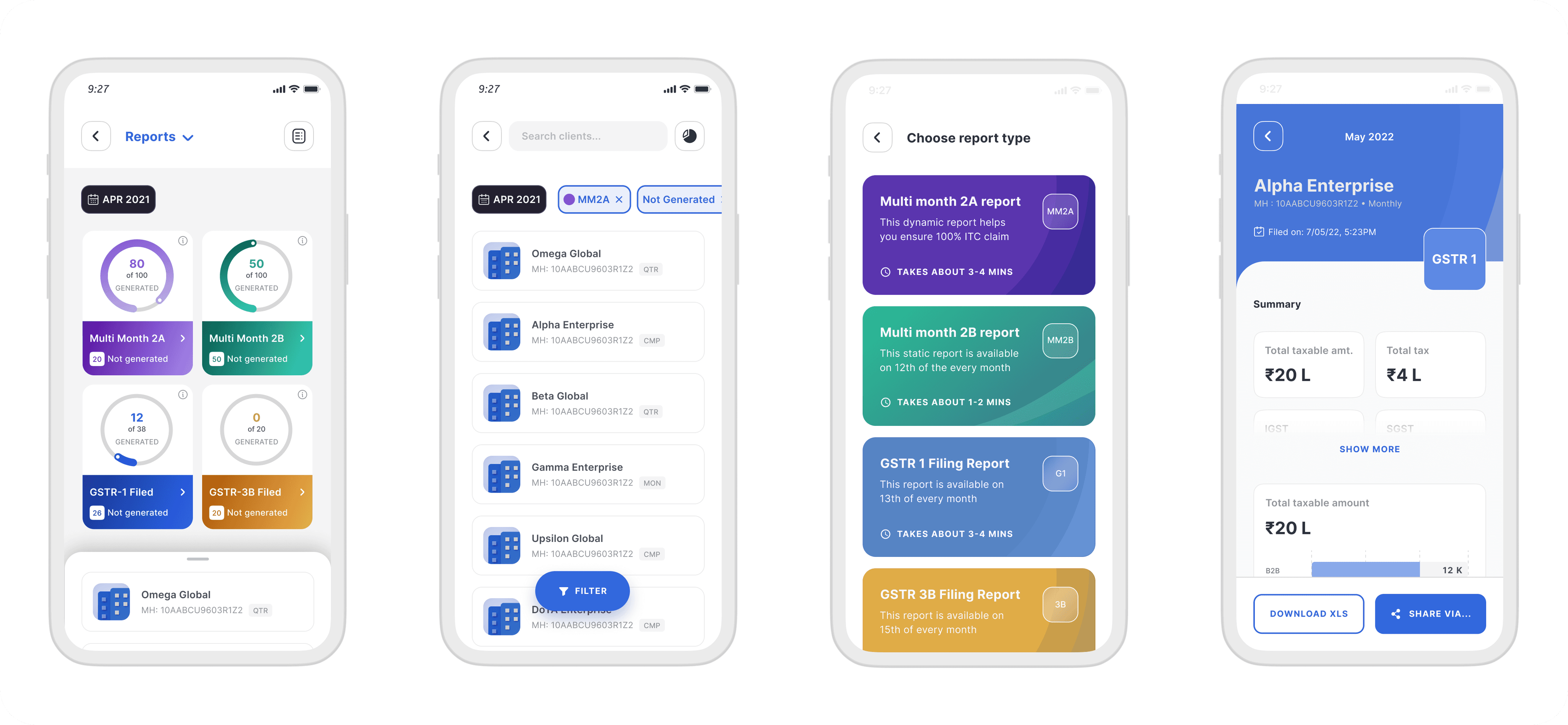
Users can view total generated reports and list of the respective clients.
Users can filter through all their clients based on report type, report status.
Manually generated one of four reports for individual clients.
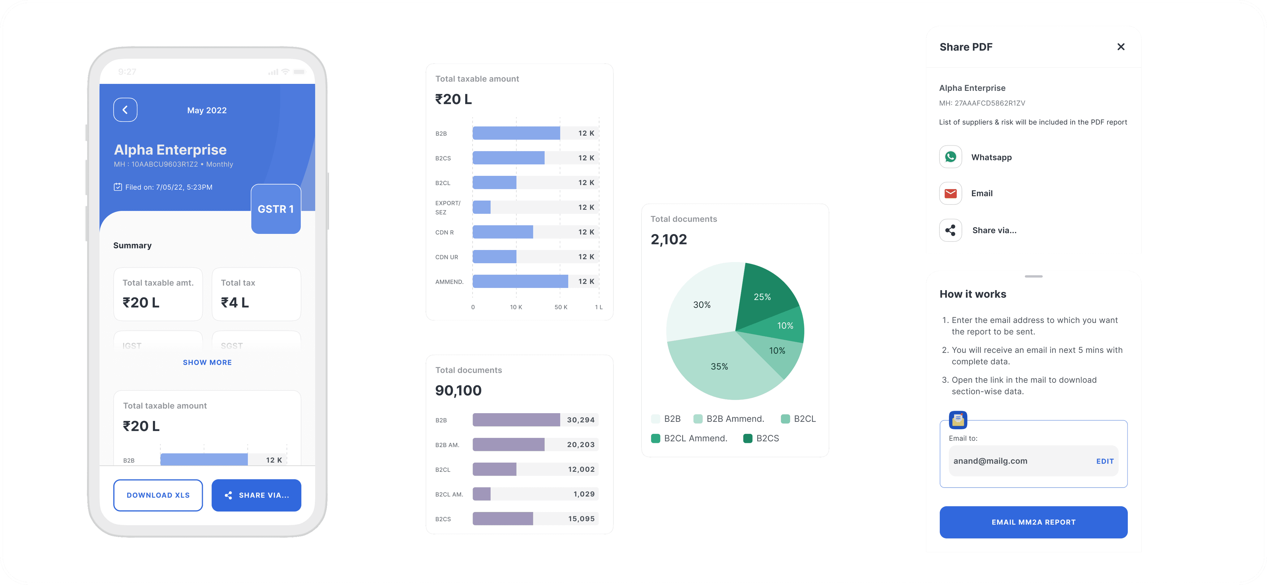
Share reports as PDF or XML.
Once we identified the user's needs, I mapped out the user flow, we already had an existing report creation journey which can plugged in here. For the new reports (GSTR 1 & 3B) underlying UX will remain similar with a new authentication step to meet compliance.

Design
Report dashboard UI:
Generated reports and essential components:
You can find the app live on Google Playstore and Apple App Store.
I parted ways from the organisation after wrapping up this project, and at the time of writing I have requested to get some data for the same in order to showcase customer impact and current short-comings (if any).
Hope this UX problem was interesting to you. Thank you for reading.
ClearPro is a productivity app for tax experts and chartered accountants. It is designed to make the jobs of tax professionals easier. This app allows professionals in India to check on the GST compliance of their clients at any time, along with many more tools to aid their clients in keeping up with the latest compliance and daily news.
I was part of this project with a team of three designers, a product manager, and a couple of developers. I worked on a functionality called Reports Dashboard.
My Role:
I was tasked with designing the app's Reports Dashboard. This allowed users to examine and generate periodic reports for their clients' tax filings. Tax experts use this software to manage clients' tax tasks and advise them with the reports generated by it. The app already generated two reports (MM2A & MM2B), but the dashboard and a few additional crucial reports are lacking.
Ideation:
I started out by doing some basic research. Luckily, there was already user research data available from the recent past that I could refer to. I started out with some internal user interviews and tested out some quick low fidelity wireframes.
These reports are generated automatically on a set date for the respective clients. As a tax expert, a quick prompt that shows the total generated reports will provide a good indicator for the expert to take the next step. After user interviews & stakeholder discussions, we scoped out the essential requirements:
Users can view total generated reports and list of the respective clients.
Users can filter through all their clients based on report type, report status.
Manually generated one of four reports for individual clients.
Share reports as PDF or XML.
Once we identified the user's needs, I mapped out the user flow, we already had an existing report creation journey which can plugged in here. For the new reports (GSTR 1 & 3B) underlying UX will remain similar with a new authentication step to meet compliance.

Design
Report dashboard UI:

Generated reports and essential components:

You can find the app live on Google Playstore and Apple App Store.
I parted ways from the organisation after wrapping up this project, and at the time of writing I have requested to get some data for the same in order to showcase customer impact and current short-comings (if any).
Hope this UX problem was interesting to you. Thank you for reading.
ClearPro is a productivity app for tax experts and chartered accountants. It is designed to make the jobs of tax professionals easier. This app allows professionals in India to check on the GST compliance of their clients at any time, along with many more tools to aid their clients in keeping up with the latest compliance and daily news.
I was part of this project with a team of three designers, a product manager, and a couple of developers. I worked on a functionality called Reports Dashboard.
My Role:
I was tasked with designing the app's Reports Dashboard. This allowed users to examine and generate periodic reports for their clients' tax filings. Tax experts use this software to manage clients' tax tasks and advise them with the reports generated by it. The app already generated two reports (MM2A & MM2B), but the dashboard and a few additional crucial reports are lacking.
Ideation:
I started out by doing some basic research. Luckily, there was already user research data available from the recent past that I could refer to. I started out with some internal user interviews and tested out some quick low fidelity wireframes.
These reports are generated automatically on a set date for the respective clients. As a tax expert, a quick prompt that shows the total generated reports will provide a good indicator for the expert to take the next step. After user interviews & stakeholder discussions, we scoped out the essential requirements:
Users can view total generated reports and list of the respective clients.
Users can filter through all their clients based on report type, report status.
Manually generated one of four reports for individual clients.
Share reports as PDF or XML.
Once we identified the user's needs, I mapped out the user flow, we already had an existing report creation journey which can plugged in here. For the new reports (GSTR 1 & 3B) underlying UX will remain similar with a new authentication step to meet compliance.

Design
Report dashboard UI:

Generated reports and essential components:

You can find the app live on Google Playstore and Apple App Store.
I parted ways from the organisation after wrapping up this project, and at the time of writing I have requested to get some data for the same in order to showcase customer impact and current short-comings (if any).
Hope this UX problem was interesting to you. Thank you for reading.
